Grids
This is the first of a short set of articles that will re-visit some of iOS 14's SwiftUI features. Now we're a year on from its release, it's possible that if your company follows the one back rule that you can now use all these features.
Today, we're going to take a look at grids, the CollectionView of the SwiftUI world. There'll be examples of what I think are the most common grids, so feel free to just skip around and take some code. There's an Xcode project linked below that you can run locally to see these in action, and I highly recommend you do so.
LazyHGrid & LazyVGrid
First we'll build a very simple grid to get to grips with the options available to us, before getting a little more advanced. The first example will be a grid of coloured squares that are all the exact same size.
You'll need Xcode 12 to run the stuff we're looking at today, with a minimum OS deployment target of 14.0.
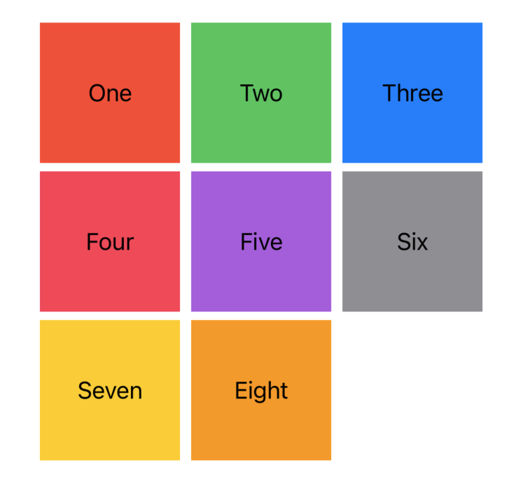
This is a very simple grid of squares that show a name with a color background. Before this was an option you had to manually do a whole lot of H and V Stacks.
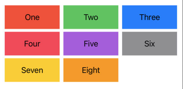
Here's what a simple grid looks like in code. Its not too complex and handles all the sizing work for us ( kind of. ).
struct ColorVGrid: View {

    let gridItems = Array(repeating: GridItem(.flexible()), count: 3)
    let gridContent = GridSquareModel.all

    var body: some View {
        LazyVGrid(columns: gridItems, spacing: 6) {
            ForEach(gridContent, id: \.self) { gridContent in
                Text(gridContent.name)
                    .frame(maxWidth: .infinity, minHeight: 50, maxHeight: 50)
                    .background(gridContent.color)
            }
        }
    }
}
struct ColorVGrid: View {
let gridItems = Array(repeating: GridItem(.flexible()), count: 3)
let gridContent = GridSquareModel.all
var body: some View {
LazyVGrid(columns: gridItems, spacing: 6) {
ForEach(gridContent, id: \.self) { gridContent in
Text(gridContent.name)
.frame(maxWidth: .infinity, minHeight: 50, maxHeight: 50)
.background(gridContent.color)
}
}
}
}There's some new bits here that you won't have encountered if you didn't use grids, so let's go through each.
GridItem is the way we describe the content of our grid. There's multiple options for GridItem, including flexible, adaptive and fixed. We'll go over these in more detail later, but in this example flexible simply tells the grid "I want you to fit this in the space given, making sure that there's enough room for each row/column". I've asked for three here, so it will automatically split the grid into three.
LazyVGrid is one of the grids available, alongside LazyHGrid. The vertical option will add items along each column until there's no columns left, then add another row. The horizontal option will add items along each row until it runs out of spaces, then add another column.
The vertical grid will define the horizontal size of the item for you, and the horizontal grid will define the vertical size of the item for you. This means you'll have to manually define the size on the other axis ( if you're not using fixed grid items. ).
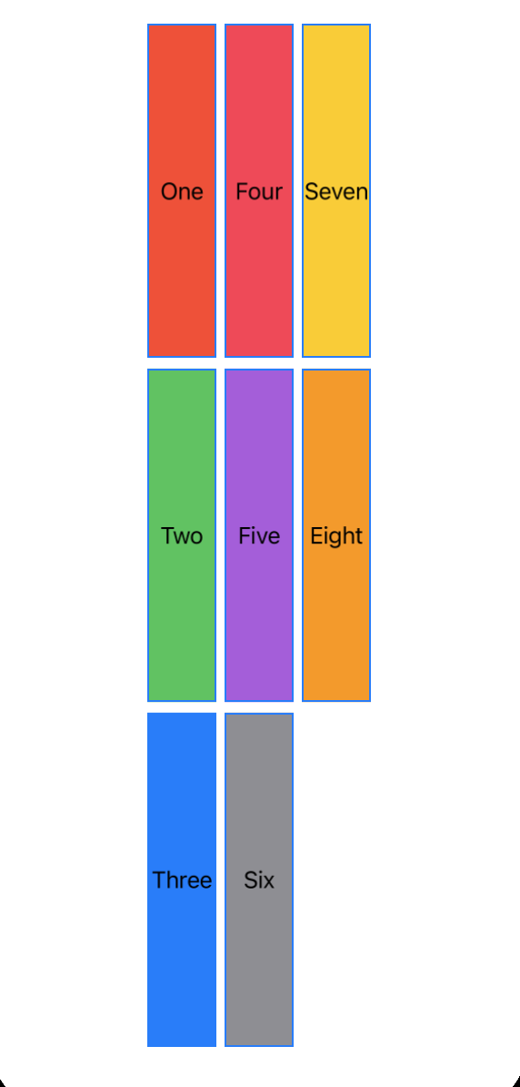
To see the difference between the grids lets look at that same example, but make a couple of changes.
struct ColorHGrid: View {

    let gridItems = Array(repeating: GridItem(.flexible()), count: 3)
    let gridContent = GridSquareModel.all

    var body: some View {
        LazyHGrid(rows: gridItems, spacing: 6) {
            ForEach(gridContent, id: \.self) { gridContent in
                Text(gridContent.name)
                    .frame(minWidth: 50, maxWidth: 50, maxHeight: .infinity)
                    .background(gridContent.color)
            }
        }
    }
}
struct ColorHGrid: View {
let gridItems = Array(repeating: GridItem(.flexible()), count: 3)
let gridContent = GridSquareModel.all
var body: some View {
LazyHGrid(rows: gridItems, spacing: 6) {
ForEach(gridContent, id: \.self) { gridContent in
Text(gridContent.name)
.frame(minWidth: 50, maxWidth: 50, maxHeight: .infinity)
.background(gridContent.color)
}
}
}
}
This time, we're making sure the content fills all the space available to it on the vertical axis, and defining the width manually. You'll notice that the text counts from the top left, goes down to the bottom, and then wraps to the next column.
GridItem
The magic of these grids actually comes from GridItem itself. Let's take a look at how we can use each of these to create grid layouts.
Fixed
Fixed is the simplest of the options and takes one argument, which is the exact size for the item, along the axis of the grid. Remember, a horizontal grid defines the vertical height for you, and vertical defines the horizontal.
A fixed grid offers no protection with overlapping. If you ask for 6 grid items, all 400 wide, it will go outside the bounds of a view.
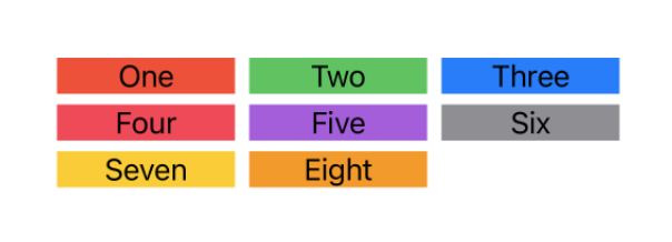
In this example, we've asked for 3 100 wide items. This should fit on most devices, but if we asked for higher width we'd likely run into problems. Personally, I wouldn't recommend using fixed unless you have a very specific use-case.
struct FixedVGrid: View {

    let gridItems = Array(repeating: GridItem(.fixed(100)), count: 3)
    let gridContent = GridSquareModel.all

    var body: some View {
        LazyVGrid(columns: gridItems, spacing: 6) {
            ForEach(gridContent, id: \.self) { gridContent in
                Text(gridContent.name)
                    .frame(maxWidth: .infinity, maxHeight: .infinity)
                    .background(gridContent.color)
            }
        }
    }
}
struct FixedVGrid: View {
let gridItems = Array(repeating: GridItem(.fixed(100)), count: 3)
let gridContent = GridSquareModel.all
var body: some View {
LazyVGrid(columns: gridItems, spacing: 6) {
ForEach(gridContent, id: \.self) { gridContent in
Text(gridContent.name)
.frame(maxWidth: .infinity, maxHeight: .infinity)
.background(gridContent.color)
}
}
}
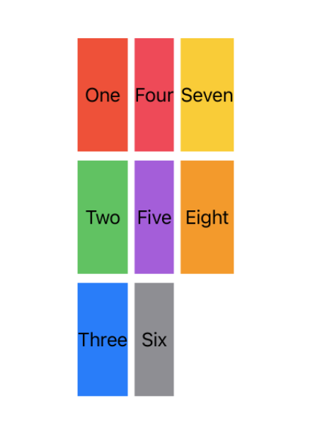
}If we look at how that behaves with an H Grid, we see that the items are all 100 tall and define their own width.
struct FixedHGrid: View {

    let gridItems = Array(repeating: GridItem(.fixed(100)), count: 3)
    let gridContent = GridSquareModel.all

    var body: some View {
        LazyHGrid(rows: gridItems, spacing: 6) {
            ForEach(gridContent, id: \.self) { gridContent in
                Text(gridContent.name)
                    .frame(maxWidth: .infinity, maxHeight: .infinity)
                    .background(gridContent.color)
            }
        }
    }
}
struct FixedHGrid: View {
let gridItems = Array(repeating: GridItem(.fixed(100)), count: 3)
let gridContent = GridSquareModel.all
var body: some View {
LazyHGrid(rows: gridItems, spacing: 6) {
ForEach(gridContent, id: \.self) { gridContent in
Text(gridContent.name)
.frame(maxWidth: .infinity, maxHeight: .infinity)
.background(gridContent.color)
}
}
}
}Flexible
We've already seen flexible, but let's look at it in a little more detail. Flexible allows you to define a minimum and or maximum size, or just omit them entirely to left SwiftUI handle it all for you. With flexible you'll need to define your own amount of rows/columns or each item will just take up a whole row/column.
When you do set a minimum or maximum, you'll need to be careful there's actually enough room for the amount of rows/columns you've asked for, or you get the same issue with fixed where things just don't fit within bounds.
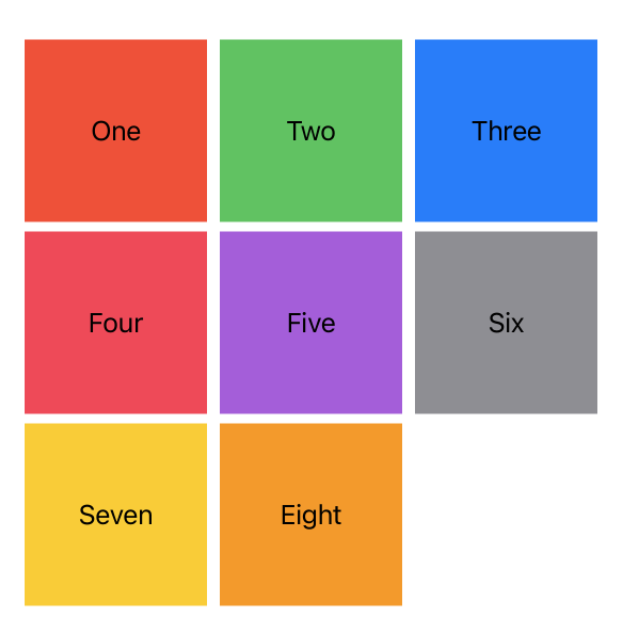
Let's take the example from earlier and go a little further with it, creating a grid of squares without a fixed height. This is my most common use case for grids, and this exact code powers all the grids in Coffee Book.
struct FlexibleVGrid: View {
    let gridItems = Array(repeating: GridItem(.flexible()), count: 3)
    let gridContent = GridSquareModel.all

    var body: some View {
        LazyVGrid(columns: gridItems, spacing: 6) {
            ForEach(gridContent, id: \.self) { gridContent in
                Text(gridContent.name)
                    .frame(maxWidth: .infinity, maxHeight: .infinity)
                    .aspectRatio(1.0, contentMode: .fill)
                    .background(gridContent.color)
            }
        }
    }
}
struct FlexibleVGrid: View {
let gridItems = Array(repeating: GridItem(.flexible()), count: 3)
let gridContent = GridSquareModel.all
var body: some View {
LazyVGrid(columns: gridItems, spacing: 6) {
ForEach(gridContent, id: \.self) { gridContent in
Text(gridContent.name)
.frame(maxWidth: .infinity, maxHeight: .infinity)
.aspectRatio(1.0, contentMode: .fill)
.background(gridContent.color)
}
}
}
}The only difference between this example and earlier is that we've told the text to be as big as it possibly can, and that we've set an aspect ratio on it.
When combined with grids aspect ratio is a very powerful tool, allowing you to easily define the shape of your items without a fixed number. The argument for aspect ratio is the ratio of width to height, so 2.0 would be a rectangle twice as long as it is tall.
Let's look at that same example with a minimum size of 100 and a count of 6.
let gridItems = Array(repeating: GridItem(.flexible(minimum: 100)), count: 6)
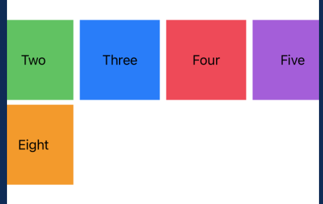
Here, the content has clipped off the edge of the screen as we don't have enough room for our six items at a minimum size of 100.
To fix this, there's two options. The first is to lower the minimum size, or the second is to just let the view scroll by wrapping in a scroll view.
ScrollView(.horizontal) {
    LazyVGrid(columns: gridItems, spacing: 6) {
        ForEach(gridContent, id: \.self) { gridContent in
            Text(gridContent.name)
                .frame(maxWidth: .infinity, maxHeight: .infinity)
                .aspectRatio(1.0, contentMode: .fill)
                .background(gridContent.color)
        }
    }
    .padding()
}ScrollView(.horizontal) {
LazyVGrid(columns: gridItems, spacing: 6) {
ForEach(gridContent, id: \.self) { gridContent in
Text(gridContent.name)
.frame(maxWidth: .infinity, maxHeight: .infinity)
.aspectRatio(1.0, contentMode: .fill)
.background(gridContent.color)
}
}
.padding()
}This gives us the following result, which lets the content go out of bounds, but we can scroll to see it.

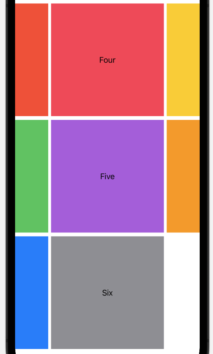
If we consider the same example with a horizontal grid, we get a bit of a different result.
struct FlexibleHGrid: View {
    let gridItems = Array(repeating: GridItem(.flexible()), count: 3)
    let gridContent = GridSquareModel.all

    var body: some View {
        LazyHGrid(rows: gridItems, spacing: 6) {
            ForEach(gridContent, id: \.self) { gridContent in
                Text(gridContent.name)
                    .frame(maxWidth: .infinity, maxHeight: .infinity)
                    .aspectRatio(1.0, contentMode: .fill)
                    .background(gridContent.color)
            }
        }
    }
}
struct FlexibleHGrid: View {
let gridItems = Array(repeating: GridItem(.flexible()), count: 3)
let gridContent = GridSquareModel.all
var body: some View {
LazyHGrid(rows: gridItems, spacing: 6) {
ForEach(gridContent, id: \.self) { gridContent in
Text(gridContent.name)
.frame(maxWidth: .infinity, maxHeight: .infinity)
.aspectRatio(1.0, contentMode: .fill)
.background(gridContent.color)
}
}
}
}Whats happening here is that each items height ( as defined by our H Grid ) is 1/3rd of the screen, so when we say to have an aspect ratio of 1.0, we're telling each item to also be as wide as 1/3rd of the screens height.
To get around this we have the same options as before - set a maximum size, or just let the view scroll. Here we've got a maximum size of 100 as that should fit on most devices.
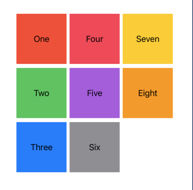
The only change to achieve this was to set the grid items to let gridItems = Array(repeating: GridItem(.flexible(maximum: 100)), count: 3).
Adaptive
Adaptive is a special version of flexible that offers automatic calculation of the amount of rows/columns. It will take the given minimum and maximum and work out how many of said items it can fit on the screen. Instead of using an array of flexible items, you can simply just add one adaptive item with your desired minimum and maximum.
Let's consider our example from earlier, with a minimum size of 100 and a column count of three. Whilst this will fit on all iPhones, on the iPad it will look a bit silly with far too much wasted space.
struct AdaptiveVGrid: View {
    let gridItems = [GridItem(.adaptive(minimum: 100, maximum: 100))]
    let gridContent = GridSquareModel.all

    var body: some View {
        LazyVGrid(columns: gridItems, spacing: 6) {
            ForEach(gridContent, id: \.self) { gridContent in
                Text(gridContent.name)
                    .frame(maxWidth: .infinity, maxHeight: .infinity)
                    .aspectRatio(1.0, contentMode: .fill)
                    .background(gridContent.color)
            }
        }
    }
}
struct AdaptiveVGrid: View {
let gridItems = [GridItem(.adaptive(minimum: 100, maximum: 100))]
let gridContent = GridSquareModel.all
var body: some View {
LazyVGrid(columns: gridItems, spacing: 6) {
ForEach(gridContent, id: \.self) { gridContent in
Text(gridContent.name)
.frame(maxWidth: .infinity, maxHeight: .infinity)
.aspectRatio(1.0, contentMode: .fill)
.background(gridContent.color)
}
}
}
}This code gives us the exact same output as our earlier grid with a minimum of 100.
This is actually just a coincidence. It turns out we only had room for three items, which was exactly what we asked for earlier on. If we change our preview device to be an iPad, things look a little different.
You can set the preview device to a different one with the preview device modifier, here's how you'd set an iPad Pro -
.previewDevice(PreviewDevice(rawValue: "iPad Pro (11-inch) (3rd generation)"))
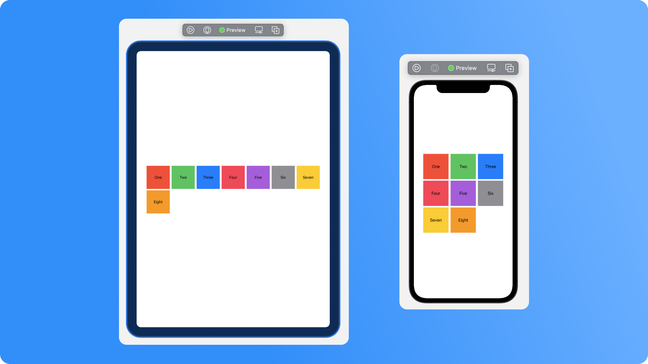
The iPad is getting to fill much more of the space available, making better use of that large screen. When building an app that works on multiple devices, adaptive is a very useful tool.
Let's look at that same sample with a horizontal grid instead.
struct AdaptiveHGrid: View {
    let gridItems = [GridItem(.adaptive(minimum: 100, maximum: 100))]
    let gridContent = GridSquareModel.all

    var body: some View {
        LazyHGrid(rows: gridItems, spacing: 6) {
            ForEach(gridContent, id: \.self) { gridContent in
                Text(gridContent.name)
                    .frame(maxWidth: .infinity, maxHeight: .infinity)
                    .aspectRatio(1.0, contentMode: .fill)
                    .background(gridContent.color)
            }
        }
    }
}
struct AdaptiveHGrid: View {
let gridItems = [GridItem(.adaptive(minimum: 100, maximum: 100))]
let gridContent = GridSquareModel.all
var body: some View {
LazyHGrid(rows: gridItems, spacing: 6) {
ForEach(gridContent, id: \.self) { gridContent in
Text(gridContent.name)
.frame(maxWidth: .infinity, maxHeight: .infinity)
.aspectRatio(1.0, contentMode: .fill)
.background(gridContent.color)
}
}
}
}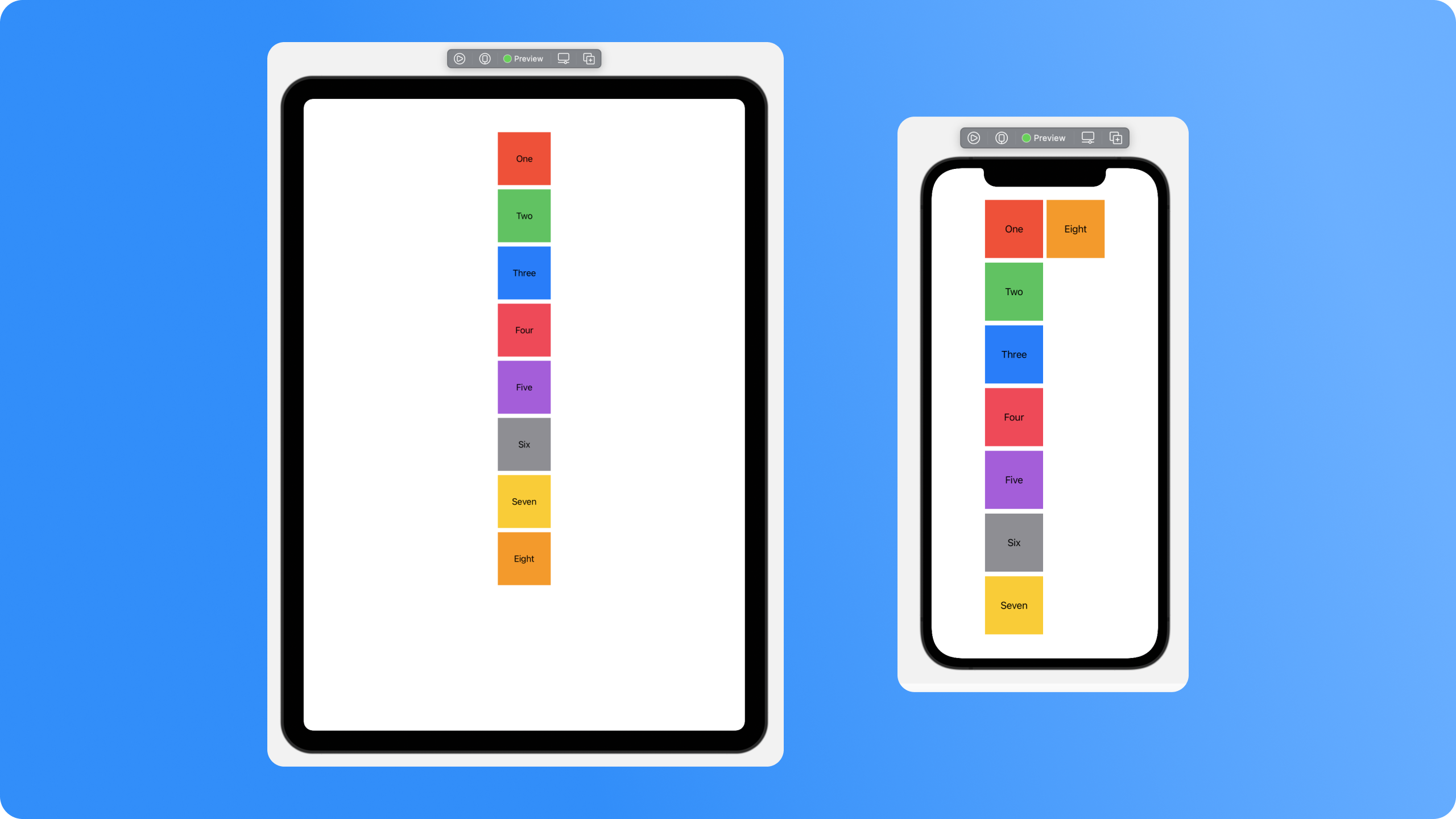
On the iPhone we've wrapped onto the second column, then on the iPad we've not even filled a full column.
Samples
With the basic understanding of grids from above, you're probably good to go. Here we'll go through a couple of more specific samples that you may end up needing in your app.
Carousels
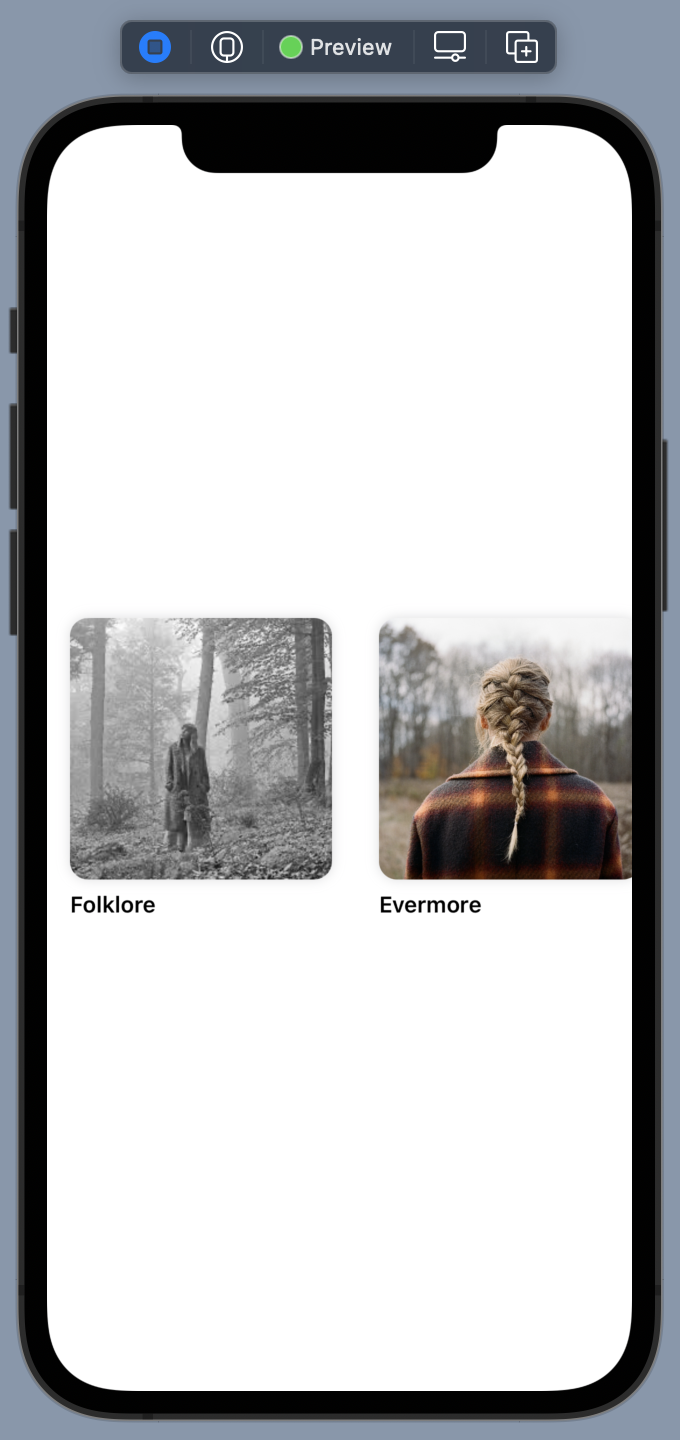
A carousel is easily created by using a horizontal grid with only one row and a fixed height, then allowing it to scroll. This means the content will scroll as long as it needs to.
struct Carousel: View {
    let gridItems = Array(repeating: GridItem(.flexible(maximum: 200)), count: 1)
    let gridContent = Album.all

    var body: some View {
        ZStack {
            Color(UIColor.systemBackground)
                .edgesIgnoringSafeArea(.all)
            ScrollView(.horizontal) {
                LazyHGrid(rows: gridItems, spacing: 6) {
                    ForEach(gridContent, id: \.self) { album in
                        makeAlbumView(album: album)
                    }
                }
                .frame(maxHeight: 200)
                .padding()
            }
        }
    }

    func makeAlbumView(album: Album) -> some View {
        VStack(alignment: .leading) {
            Image(album.image)
                .resizable()
                .aspectRatio(1.0, contentMode: .fit)
                .clipShape(RoundedRectangle(cornerRadius: 12))
                .shadow(color: .gray.opacity(0.3), radius: 4)
            Text(album.name)
                .font(.subheadline)
                .bold()
                .lineLimit(1)
        }
        .frame(maxWidth: .infinity, maxHeight: .infinity)
        .aspectRatio(1.0, contentMode: .fill)
    }
}
struct Carousel: View {
let gridItems = Array(repeating: GridItem(.flexible(maximum: 200)), count: 1)
let gridContent = Album.all
var body: some View {
ZStack {
Color(UIColor.systemBackground)
.edgesIgnoringSafeArea(.all)
ScrollView(.horizontal) {
LazyHGrid(rows: gridItems, spacing: 6) {
ForEach(gridContent, id: \.self) { album in
makeAlbumView(album: album)
}
}
.frame(maxHeight: 200)
.padding()
}
}
}
func makeAlbumView(album: Album) -> some View {
VStack(alignment: .leading) {
Image(album.image)
.resizable()
.aspectRatio(1.0, contentMode: .fit)
.clipShape(RoundedRectangle(cornerRadius: 12))
.shadow(color: .gray.opacity(0.3), radius: 4)
Text(album.name)
.font(.subheadline)
.bold()
.lineLimit(1)
}
.frame(maxWidth: .infinity, maxHeight: .infinity)
.aspectRatio(1.0, contentMode: .fill)
}
}There's nothing new here - just using what we already know and throwing it all together.
Lists ( with self-sizing "cells" )
You can use grids to create a list, too. You could argue that in situations like this its just easier to use a VStack, but I believe that the flexibility of the grid will allow for faster changes in future.
To do this, we'll need a grid that creates an item that fills the whole width of the screen and lets it define its own vertical height. This means we need a VGrid, wrapped in a scroll view, which we can configure to only have one flexible item.
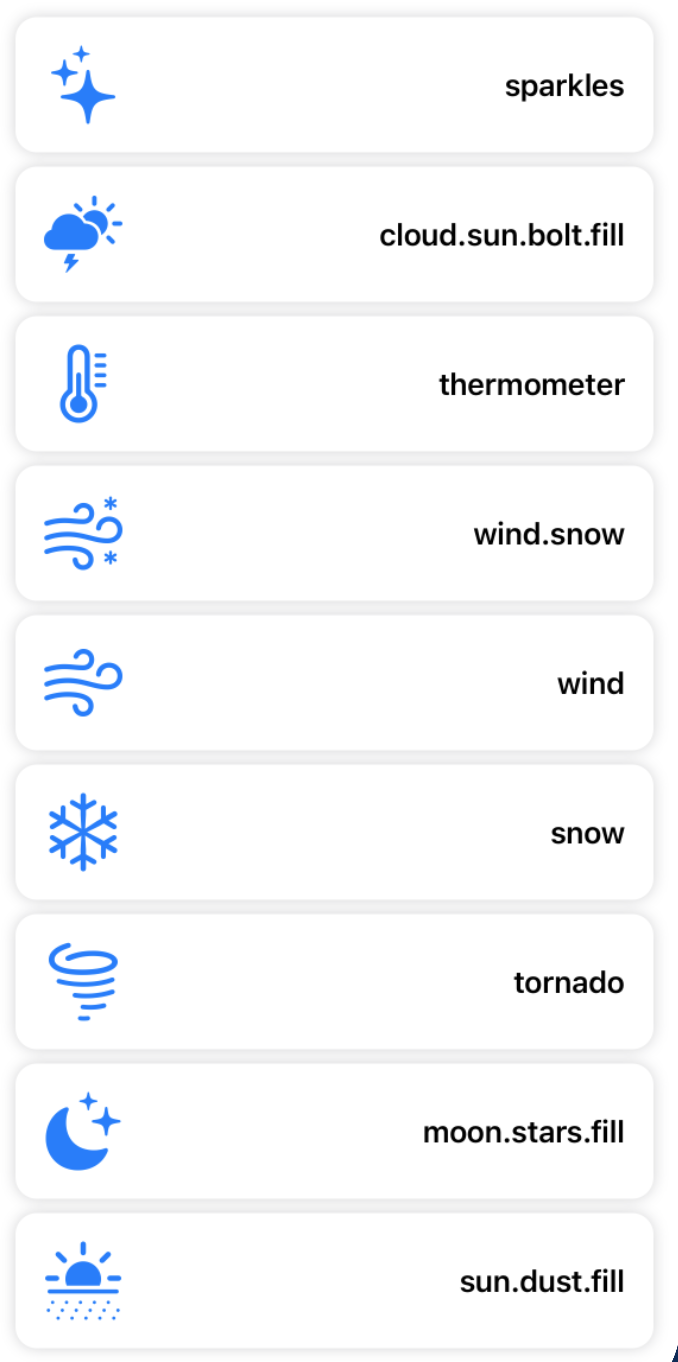
struct GridList: View {
    let gridItems = Array(repeating: GridItem(.flexible()), count: 1)
    let gridContent = SFSymbol.weather

    var body: some View {
        ScrollView(.vertical) {
            LazyVGrid(columns: gridItems) {
                ForEach(gridContent, id: \.self) { symbol in
                    makeSymbolRow(symbol: symbol)
                }
            }
            .padding()
        }
    }

    func makeSymbolRow(symbol: SFSymbol) -> some View {
        HStack {
            Image(systemName: symbol.name)
                .resizable()
                .aspectRatio(contentMode: .fit)
                .frame(width: 44, height: 44)
                .foregroundColor(.blue)
            Spacer()
            Text(symbol.name)
                .font(.headline)
        }
        .padding()
        .background(
            RoundedRectangle(cornerRadius: 12)
                .foregroundColor(Color(.systemBackground))
                .shadow(color: .gray.opacity(0.4), radius: 4)
        )
    }
}
struct GridList: View {
let gridItems = Array(repeating: GridItem(.flexible()), count: 1)
let gridContent = SFSymbol.weather
var body: some View {
ScrollView(.vertical) {
LazyVGrid(columns: gridItems) {
ForEach(gridContent, id: \.self) { symbol in
makeSymbolRow(symbol: symbol)
}
}
.padding()
}
}
func makeSymbolRow(symbol: SFSymbol) -> some View {
HStack {
Image(systemName: symbol.name)
.resizable()
.aspectRatio(contentMode: .fit)
.frame(width: 44, height: 44)
.foregroundColor(.blue)
Spacer()
Text(symbol.name)
.font(.headline)
}
.padding()
.background(
RoundedRectangle(cornerRadius: 12)
.foregroundColor(Color(.systemBackground))
.shadow(color: .gray.opacity(0.4), radius: 4)
)
}
}There's a cool trick we can do here to optimise for other devices. If we were on an iPad, we could benefit from extra columns. To do this, we can read the horizontal size class of the current device and add an extra column if we detect its the regular class.
To create this effect we need two things. First, add the environment value for the horizontal size class, then a computed variable that gives us a column count from that class.
@Environment(\.horizontalSizeClass) var horizontalSizeClass

var columnCount: Int {
    horizontalSizeClass == .regular ? 2 : 1
}@Environment(\.horizontalSizeClass) var horizontalSizeClass
var columnCount: Int {
horizontalSizeClass == .regular ? 2 : 1
}Next, change the declaration of our LazyVGrid to construct the grid items itself and read this variable, like so.
LazyVGrid(columns: Array(repeating: GridItem(.flexible()), count: columnCount))
Our final result has no change on a vertical iPhone, but gives us two columns on the iPad.

Composition
When working with collection views its common to have radically different layouts between sections, especially when you're able to use compositional layouts. We can do that in SwiftUI too, all we have to do is add them in a view that can fit them.
Let's combine our album carousel and symbol list into one screen.
struct Composition: View {
    var body: some View {
        ScrollView(.vertical) {
            VStack {
                Carousel()
                OptimisedGridList()
            }
        }
    }
}
struct Composition: View {
var body: some View {
ScrollView(.vertical) {
VStack {
Carousel()
OptimisedGridList()
}
}
}
}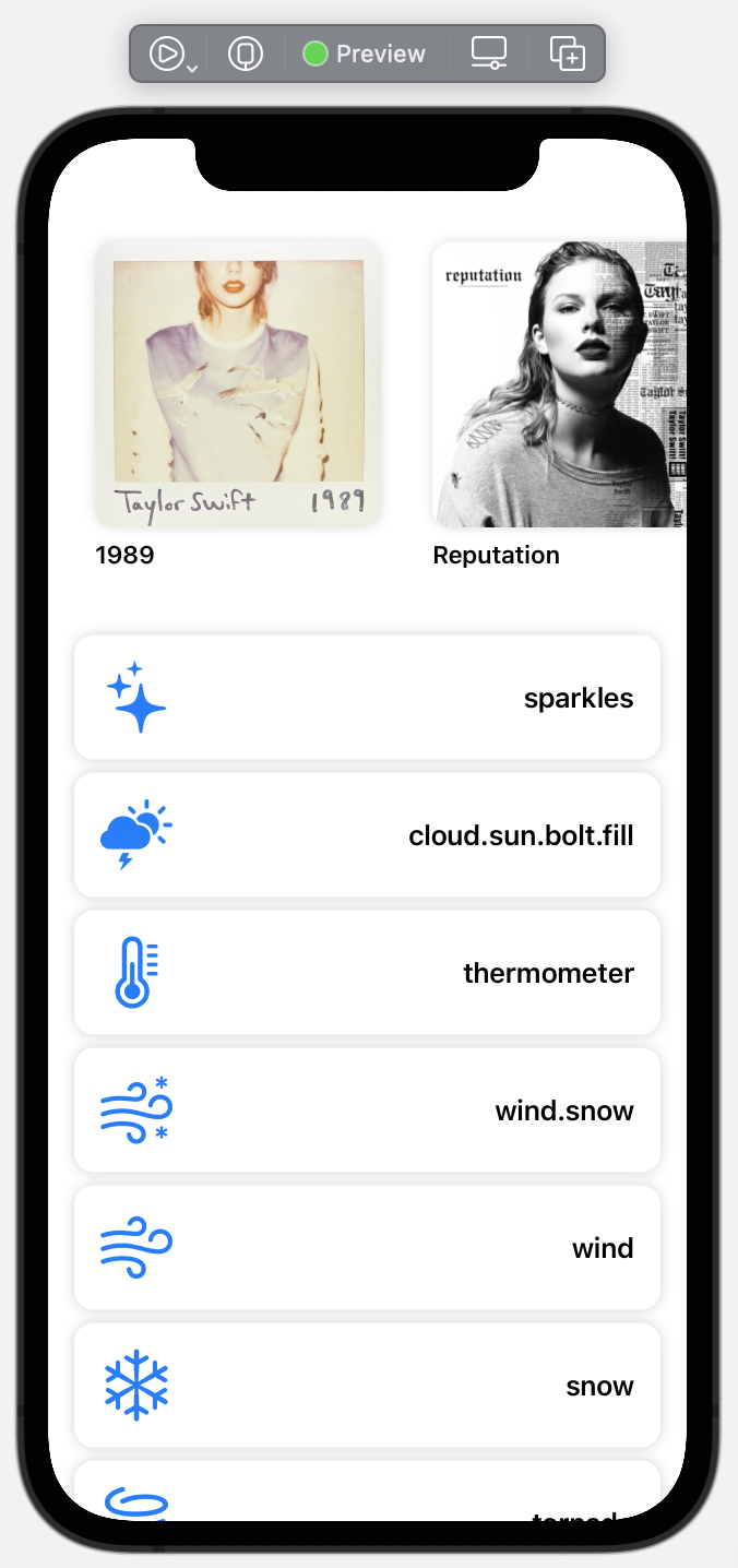
The only things to be careful with in situations like this are the appearance of many scroll indicators, which can be a bit of an eyesore at times.
Conclusion
So thats grids! There's plenty more you can do, and in future I'll do an article with some fancy layouts, but this should be enough to get you going.
Are you able to use grids now when iOS 15 launches, and will you be doing so? I'd love to hear your thoughts.
You can find the code samples in my repo as always.
If you fancy reading a little more, or sharing your experiences, I’m @SwiftyAlex on twitter.