
Hello Adaptive Tab Views

Navigation seemed settled as sidebars on iPad, tabs on iPhone, floating tabs on Apple TV, and a mixture on macOS. This year, Apple has thrown a spanner into that mix by switching out sidebars for a fancy new tab bar on iPad. Let's see how easy they've made it to implement.
Tab
The foundation for the new updates is a new Tab type. This lets you give more information about the tabs in your app, instead of using the old modifier to give them a label and icon.
Tab("Basketball", systemImage: "basketball", value: 0) {
    Text(":)")
}Tab("Basketball", systemImage: "basketball", value: 0) {
Text(":)")
}To use these in a tab view is super easy, just make sure that the TabView has its selection set to the same type as value.
struct ContentView: View {
@State var selectedTab: Int = 0
var body: some View {
TabView(selection: $selectedTab) {
Tab("Basketball", systemImage: "basketball", value: 0) {
    Text(":)")
}
}
.tabViewStyle(.sidebarAdaptable)
}
}struct ContentView: View {
@State var selectedTab: Int = 0
var body: some View {
TabView(selection: $selectedTab) {
Tab("Basketball", systemImage: "basketball", value: 0) {
Text(":)")
}
}
.tabViewStyle(.sidebarAdaptable)
}
}Your Tab can also allow for badges, added simply with the badge modifier, which can take a string or an int.
When you set the badge this way, you'll get a traditional badge in a normal tab bar, and a detail item in the sidebar.
Tab("Basketball", systemImage: "basketball", value: 0) {
    Text(":)")
}
.badge(20)Tab("Basketball", systemImage: "basketball", value: 0) {
Text(":)")
}
.badge(20)To make managing tabs easier, i've made a wrapper type for them, which you can see below.
enum Tabs: Equatable, Hashable, Identifiable {
    case basketball

    var id: Int {
        switch self {
        case .basketball:
            return 0
        }
    }
    var name: String {
        switch self {
        case .basketball:
            return "Basketball"
        }
    }
    var image: String {
        switch self {
        case .basketball:
            return "Basketball"
        }
    }

    var customizationID: String {
        return "uk.co.alexanderlogan.samples.timmytabbers" + self.name
    }
}

// Updated usage
struct ContentView: View {
    @State var selectedTab: Tabs = .basketball

    var body: some View {
        TabView(selection: $selectedTab) {
            Tab(Tabs.basketball.name, systemImage: Tabs.basketball.image, value: Tabs.basketball) {
                Text(":)")
            }
            .badge(20)
            .customizationID(Tabs.basketball.customizationID)
        }
        .tabViewStyle(.sidebarAdaptable)
    }
}
enum Tabs: Equatable, Hashable, Identifiable {
case basketball
var id: Int {
switch self {
case .basketball:
return 0
}
}
var name: String {
switch self {
case .basketball:
return "Basketball"
}
}
var image: String {
switch self {
case .basketball:
return "Basketball"
}
}
var customizationID: String {
return "uk.co.alexanderlogan.samples.timmytabbers" + self.name
}
}
// Updated usage
struct ContentView: View {
@State var selectedTab: Tabs = .basketball
var body: some View {
TabView(selection: $selectedTab) {
Tab(Tabs.basketball.name, systemImage: Tabs.basketball.image, value: Tabs.basketball) {
Text(":)")
}
.badge(20)
.customizationID(Tabs.basketball.customizationID)
}
.tabViewStyle(.sidebarAdaptable)
}
}There's also a new TabSection, which gives us some neat behaviour. If you use a TabSection, which itself is just full of Tab, you'll get a sidebar section with your child tabs neatly laid out. When the user selects one of these items in the sidebar, the single item will be selected in the floating tab bar.
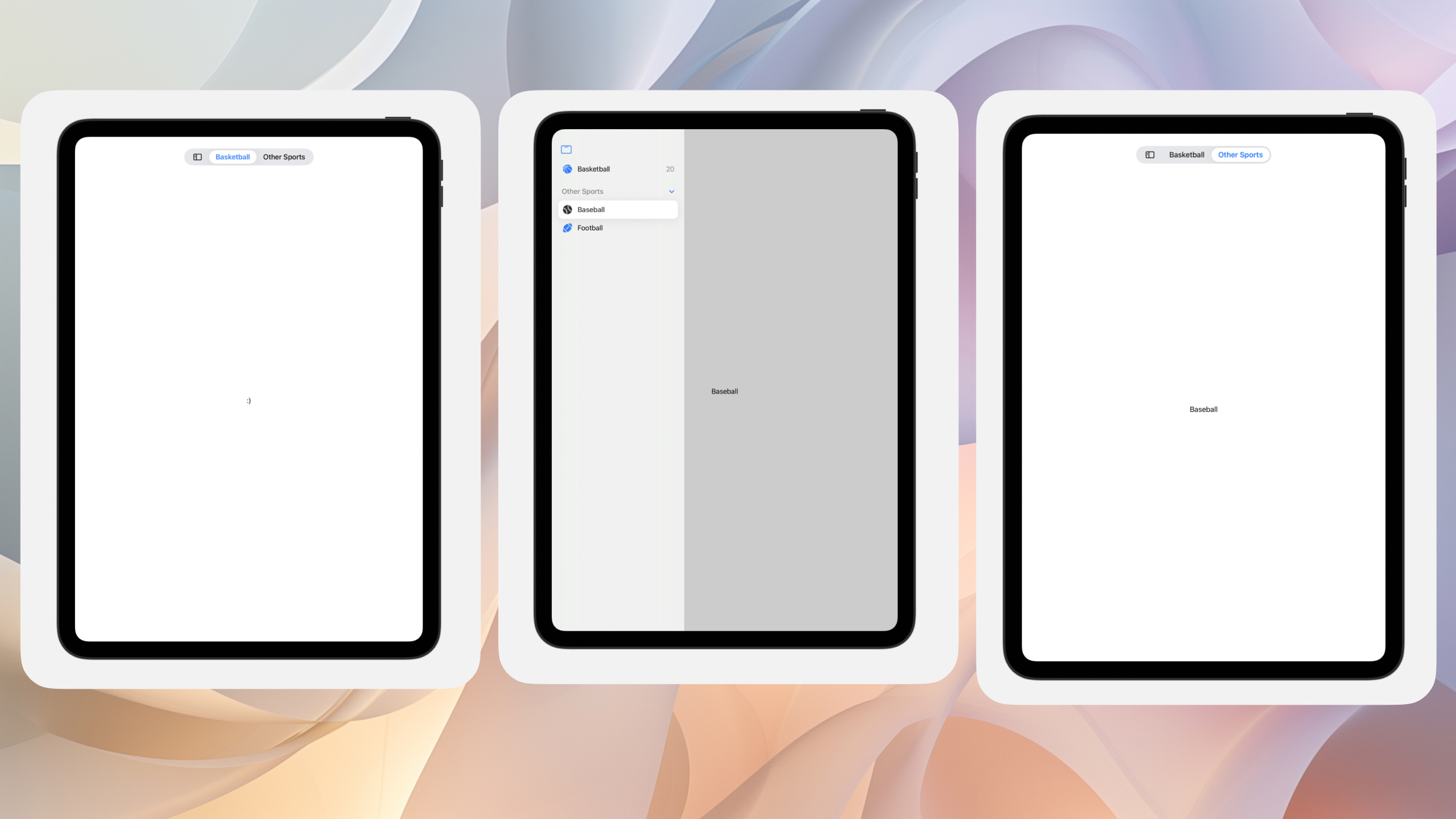
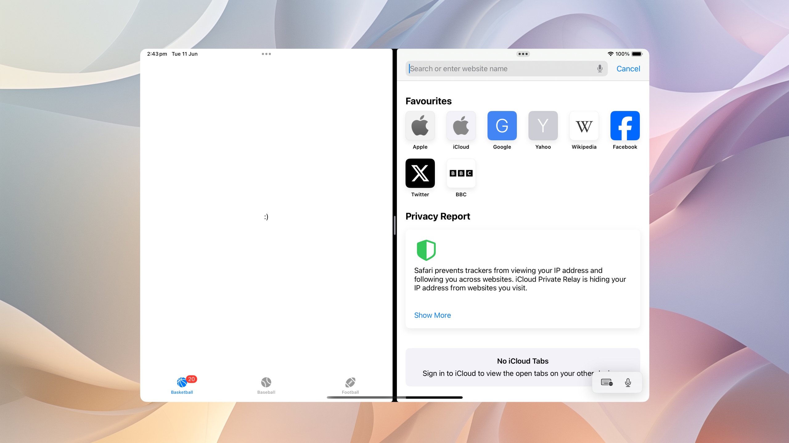
When we're in compact mode, we'll see the traditional iOS style tab bar.
If we wanted to hide certain tabs based on the trait collection, i.e, slide over, or iPhone, we can use the new hidden modifier.
@Environment(\.horizontalSizeClass) var horizontalSizeClass

Tab {
    // ...
}
.hidden(horizontalSizeClass == .compact)@Environment(\.horizontalSizeClass) var horizontalSizeClass
Tab {
// ...
}
.hidden(horizontalSizeClass == .compact)Customisation
We can also take advantage of new customisation options available to the user, to allow them to make the tab bar their own. In this example, the user should be able to pick which sports they want at the top.
To do this, first add a customisationID to each tab.
Tab(Tabs.basketball.name, systemImage: Tabs.basketball.image, value: Tabs.basketball) {
    Image(Tabs.baseball.image)
        .font(.title.weight(.semibold))
        .fontDesign(.rounded)
}
.customizationID(Tabs.basketball.customizationID)Tab(Tabs.basketball.name, systemImage: Tabs.basketball.image, value: Tabs.basketball) {
Image(Tabs.baseball.image)
.font(.title.weight(.semibold))
.fontDesign(.rounded)
}
.customizationID(Tabs.basketball.customizationID)Next, enable customisation by adding the tabViewCustomisation modifier, and storing an instance of TabViewCustomisation. For best practice, throw this in AppStorage, so the users customisations persist between runs.
struct ContentView: View {
    @State var selectedTab: Tabs = .basketball
    @AppStorage("sidebarCustomizations") var tabViewCustomization: TabViewCustomization
    @Environment(\.horizontalSizeClass) var horizontalSizeClass

    var body: some View {
        TabView(selection: $selectedTab) {
            ForEach([Tabs.basketball, Tabs.cricket]) { tab in
                Tab(tab.name, systemImage: tab.image, value: tab) {
                    SportView(tab: tab)
                }
                .customizationID(tab.customizationID)
            }

            TabSection(content: {
                ForEach([Tabs.baseball, Tabs.football]) { tab in
                    Tab(tab.name, systemImage: tab.image, value: tab) {
                        SportView(tab: tab)
                    }
                    .customizationID(tab.customizationID)
                }
            }, header: {
                Text("Other Sports")
            })
        }
        .tabViewCustomization($tabViewCustomization)
        .tabViewStyle(.sidebarAdaptable)
    }
}
struct ContentView: View {
@State var selectedTab: Tabs = .basketball
@AppStorage("sidebarCustomizations") var tabViewCustomization: TabViewCustomization
@Environment(\.horizontalSizeClass) var horizontalSizeClass
var body: some View {
TabView(selection: $selectedTab) {
ForEach([Tabs.basketball, Tabs.cricket]) { tab in
Tab(tab.name, systemImage: tab.image, value: tab) {
SportView(tab: tab)
}
.customizationID(tab.customizationID)
}
TabSection(content: {
ForEach([Tabs.baseball, Tabs.football]) { tab in
Tab(tab.name, systemImage: tab.image, value: tab) {
SportView(tab: tab)
}
.customizationID(tab.customizationID)
}
}, header: {
Text("Other Sports")
})
}
.tabViewCustomization($tabViewCustomization)
.tabViewStyle(.sidebarAdaptable)
}
}Now when we run the app, users are allowed to customise the content not only of the main bar itself, but also the items in the tabs group.
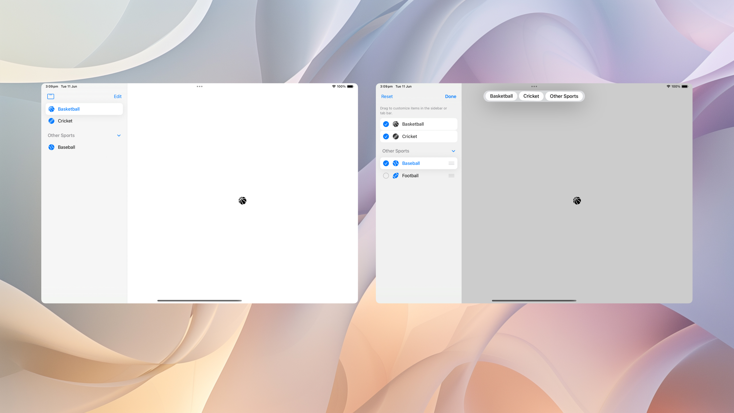
If we have some items we want to prevent customisation on, we can do that by setting our customisation behaviour to be disabled.
We can disable it specifically for the sidebar, tab bar, or all.
Tab {
    // ...
}
.customizationBehavior(.disabled, for: .automatic)
Tab {
// ...
}
.customizationBehavior(.disabled, for: .automatic)We can also set a prefernce for the initial state. For example, you might want the users to start with just one sport, and add the rest later.
This is built in too, using defaultVisibility.
Tab {
    // ...
}
.defaultVisibility(.hidden, for: .automatic)
Tab {
// ...
}
.defaultVisibility(.hidden, for: .automatic)I love the new design! What do you think?
If you fancy reading a little more, or sharing your experiences, I’m @SwiftyAlex on twitter.